How I got a C-level to say:
“We NEED this now”
Some background
I spent the summer of 2024 as a UX Intern at Promaxo, an Oakland-based company that develops compact, office-based MRI systems for accessible and precise medical imaging, specifically for biopsies. Their technology enables real-time, high-resolution imaging in outpatient settings, useful for guided interventions. My main project for the summer was to redesign the entire GUI on the machine's screen to make it intuitive and usable for increased use and scale as the young company began it’s growth.
I finished this first project earlier than anticipated, so I found myself with nothing to do for the second half of the summer. For this reason, I undertook a second initiative. Unsure as to what problem I could solve for Promaxo and it’s users, as a true UXer, I went out to find one. So I got in the car and drove 2 hours to the closest active Promaxo machine at Golden State Urology in Sacramento to conduct in-person contextual inquiries by watching the Promaxo machine in use for actual biopsies.
How can I find the most pressing problem ?
To thoroughly derive areas for meaningful product improvements, I followed a structured research approach while observing the biopsies:
Observation & Stakeholder Interviews: Conducted direct observations in an operating room and interviewed clinical engineers and urologists to understand workflow pain points.
Heuristic Evaluation: Assessed the existing UI against usability best practices to identify key design flaws.
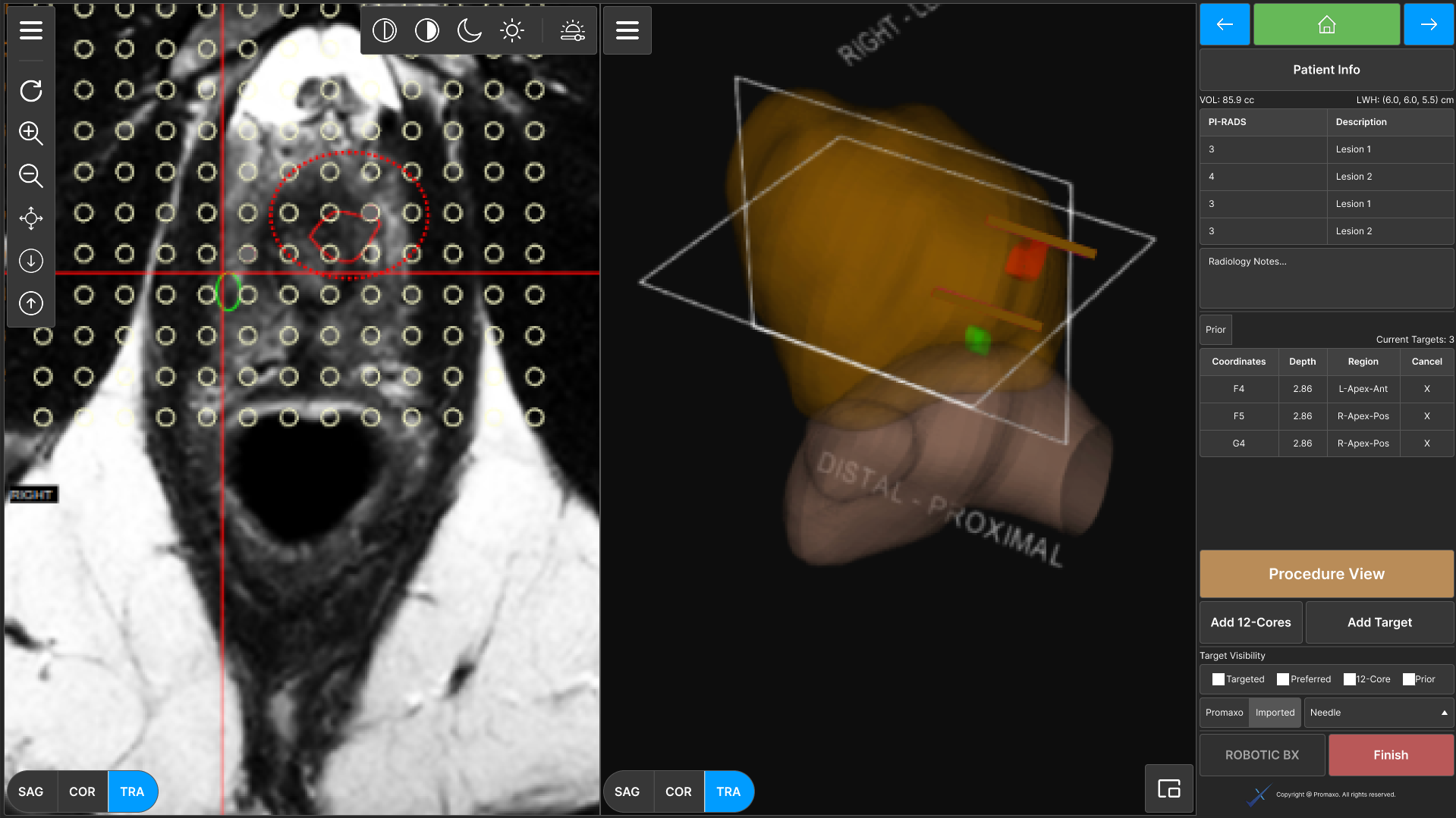
Fig 1. The table on the right contains the vital information: the target coordinates, the depth, etc. It also has the delete action. As you can see, everything is small and difficult to work with. Now imagine this screen all the way on the other side of the room.Physical Placement:
The machine is positioned in a corner to allow the urologist maximum space, creating a visibility issue.
Unreadable UI:
The current interface displays target coordinates in a tiny font, necessitating the engineer to be close to the screen.
Cumbersome Editing Workflow:
Adjusting targets (adding or deleting points) requires multiple clicks and is unintuitive, slowing down procedures.
The Problems that were uncovered were Quite concerning
During a Promaxo biopsy, clinical engineers communicate precise target locations to urologists using a 13x13 grid, much like the game Battleship. However, due to spatial constraints in the operating room and usability issues with the current UI, inefficiencies arise.
In addition to these issues, practically, clinical engineers are frequently engaged in the procedure, making it difficult to walk back and forth between the machine and the urologist. This can lead to delays or, worse, miscommunication of target points, impacting procedural efficiency and patient outcomes.
Solutions
Fig 2. The procedure view has larger typography and a new target editing flow. Users click any target they wish to add, and it is staged (Fig. 3 for staged view). The staged state was to prevent accidental target additions.1. Improving Readability for Better Decision-Making
Problem
The small font size of the current UI forces engineers to walk over to the machine, breaking their workflow and increasing cognitive load.
Solution
Larger Font & High-Contrast Display: Increased font size and contrast for improved visibility from any corner of the room, reducing the need for verbal communication.
Grid Overlay on Patient View: Allowed engineers to visually reference coordinates directly on the patient’s screen, reducing reliance on memory.
Fig 3. The delete point actions are larger, now with a red fill. This allows the clinical engineer to edit targets more seamlessly and intuitively, speeding up the biopsy and increasing patient satisfaction.2. Enhancing Target Editing for Faster Adjustments
Problem
The existing target editing process was cumbersome, requiring multiple clicks, and increasing procedural time.
Solution
Single-Click Target Selection: Allowed engineers to add or delete points with a single click instead of navigating through multiple menus.
Staged Additions for Error Prevention: Introduced a “staging” phase where new targets are previewed before finalizing, reducing accidental selections.
Larger Delete Actions: Used color-coded, clearly labeled buttons to make deleting points more intuitive and immediate.
Results & Business Impact
Although this feature is still in development, it received approval and very positive feedback from C-level executives. The Promaxo CTO said when I presented the project, “We need this now.” Expected benefits include:
Faster Biopsy Procedures: Reduced communication delays and streamlined editing will cut down overall procedural time.
Lower Cognitive Load: Readability improvements allow engineers to focus on assisting the urologist rather than memorizing coordinates.
Increased Patient Safety: Reducing errors in target communication enhances procedural accuracy, lowering the risk of misaligned biopsies.


